Topps revisited some 1960s baseball designs for their two major sports issues in 1983. Topps celebrated the 20th anniversary of the 1963 set with a similar design, with a second photo in a circle at the bottom of the card. The colors are less vibrant than the original '63 set. Meanwhile, the football set strongly resembles the 1967 baseball set, though the font for the team name is very Eighties.

The only other sports issue for Topps in '83 was a set featuring great Olympians of the past, in anticipation of Olympic fever for the LA games the following year. The design is a bit similar to '74 baseball and '76 football, this time with the Olympic logo and country flag dominating. (I wonder if there is a Cy Young Award in javelin?)

Topps put out several non-sport sets as well. As a six-year-old in 1983, the Return of the Jedi was the first trading card set I ever collected (and completed!) The design is classy but oddly sparse for a Topps non-sport release. Empire Strikes Back didn't have a movie logo either but at least had a very futuristic look. There were two series, the first in red, and the second in blue. I picked a blue card to go with the one random A-Team card I have. This one is more typical of Topps designs, with a prominent A-Team logo.


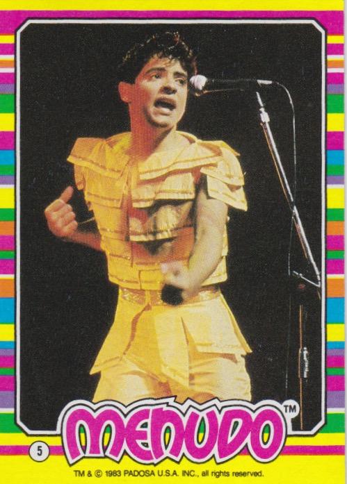
Topps put out one music-related set in '83. This design for Menudo is one of the most colorful ever by Topps.
Finally, there was one more set that Topps put out in 1983. A few years ago Billy Kingsley posted it to A Pack to be Named Later, calling it "one of the best packs of cards I've ever opened". Two of the comments to the post called it the greatest set of all time, while others had comments like "Love These!" and "Hall. Of. Fame."
The design is quite simple, which is effective in emphasizing the subjects of the photos. Nameneko, marketed as Perlorian in the US, was a Japanese fad which involved dressing cats up as people and taking photos of them. They were hugely popular in Japan, and it seemed Topps was anticipating a similar phenomenon in the US. Though they never really took of in the US, this set is still beloved by certain collectors to this day.

I had a Carlton poster and a Polish Rifle poster in my youth. And Return of the Jedi action figures, but no poster.
ReplyDeleteNow I have the A-Team theme song in my head. Not a bad thing.
ReplyDeleteI'm very glad that the cat fad never caught on here.
ReplyDeleteTopps baseball had the best design by far in 1983. The Greatest Olympians would be my second favorite design. Not a fan of the Perlorian Cats design, but the cards are fantastic!
ReplyDelete