After a very simple design year in 1989, Topps must have brought in some new blood to their creative department in 1990. Perhaps feeling the pressure from upstart Upper Deck, but not yet ready to commit to matching them on the photography front, Topps went all-in on big designs for their 1990 sets.
The brightly colored borders on the baseball set are well known, in one of the "loudest" baseball designs Topps ever produced. While football and hockey had more reserved designs, the football and hockey stick dominating the two designs make sure to hit the collector over the head with what sport they are in.


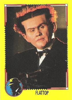
Unlike 1989, most of the big movie "hits" of 1990 didn't last as classics. Dick Tracy was supposed to be the next Batman but fizzled badly. The design is not bad, kind of art deco with what I guess are supposed to be shortwave radio waves. A lot of collectors seem to dislike yellow borders, unfortunately.


Topps produced one other movie set in 1990. RoboCop 2 has to be one of, if not the most gory sets ever made for kids. I've never seen any of the RoboCop movies, but it certainly seems to be quite graphic. Quickly browsing through some of the cards on TCDB, within the first seven cards I found one of a dead body covered in blood and two of characters graphically losing their arm or hand. Even the design has a bloody feel to it.

The football and baseball sets from these years have always bored me. Kind of like the hockey style.
ReplyDeleteyeah, Robocop is Ultra-violent. The director of the movie, Paul Verhoeven, was known for violence and gore and pushing the limits of an R-rating. He also directed Total Recall, Starship Troopers, Hollowman, Basic Instinct and Showgirls. Definitely not family friendly!
ReplyDelete👍
ReplyDeleteThe Simpsons card is my favorite design... but the Phoebe Cates is my favorite card.
ReplyDeleteRobocop 2 definitely wasn't marketed to youngsters, so it is a bit weird that Topps would've done set for it.
ReplyDeleteAgreeing with Jon, one of Robocop2's bad guys was a kid, and he also "didn't have a chance to redeem himself", I believe, and I don't remember it being advertised for the kids. If you're gonna see one of them, see the original.
ReplyDelete