Topps produced a simple but classic design for their 1965 baseball set. The team name in the pennant remains popular with collectors to this day.

They got a little lazy elsewhere, however. The football set was an unusual, smaller shape with a very bland design, with no background and a minimal design.


There were plenty of nonsport sets for Topps in 1965. By far the most effort went into Battle: The Story of World War Two, which had minimal design features, but did have full-color, sensationalistic paintings from the war, which had ended 20 years prior.

Another unusual set was the mixed sport/non-sport set Push/Pull, where you could push or pull a tab to reveal one of two subjects of the card.

Other than being in black-and-white, Gilligan's Island had a familiar design, with an island-and-palm-trees logo that probably would have looked good in color.


Daniel Boone got a horizontal look, with minimal design.


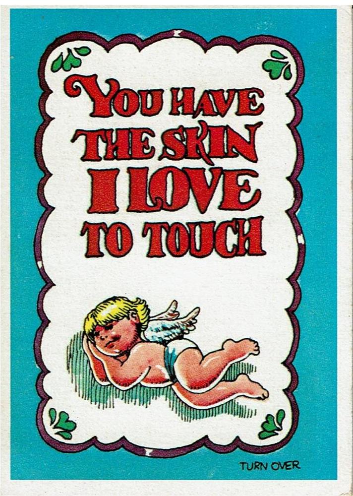
One other set produced in 1965 was one of Topps's typical humor sets, Monster Greeting Cards. The front seems like a standard greeting card . . .
. . . but the back has some adolescent dark humor.

I have a couple of those entertainment cards. My favorite by far is the Baseball for this year.
ReplyDeleteThose tallboys are a pain to protect but some of them are really nice.
ReplyDelete1965 is my favorite Topps flagship set of the decade. It's also my favorite design out of this bunch. Had no idea they release so many entertainment sets that year. And that Push/Pull set looks really cool. Maybe we'll luck out and Topps will use this idea for one of the future insert sets.
ReplyDeleteI'm not really a fan of The Man From U.N.C.L.E., but I do like the card set; despite it's lack of variety.
ReplyDelete