Night Owl recently showed off the 1976 Hostess and Kellogg's sets, both of which are awash in bicentennial red, white and blue. At Topps however, the company seemed determined to completely ignore the patriotic festivities when it came to card design. (Was Topps involved with making either of the food sets?)
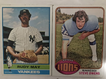
The baseball and football have simple but attractive designs that are color coded by team (though not always by team color), with no emphasis on the red, white and blue.
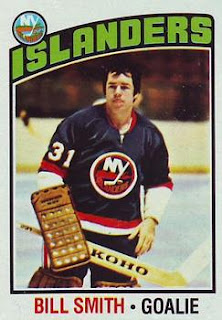
Hockey, similarly, went with the "generic sports card" look. To be fair, you wouldn't expect a bicentennial look for this sport anyway.
Basketball had the most interesting design of the four major North American sports, a "tall boy" with a fun graphic of a basketball going into the net.
Topps put out a UK soccer set in '76 as well. Usually they recycled a design from one of their US sports sets, but in '76 they made a distinct one for soccer. Like the other sports this was color-coded by team. I just picked the most red-white-and-blue one I could find.
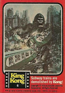
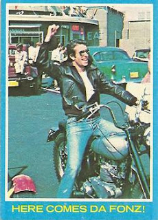
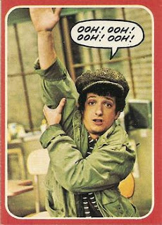
Topps put out several non-sports sets in '76. The designs were very similar, just a colored border and maybe a logo.
Red for King Kong . . .
. . . blue for Happy Days . . .
. . . red again for Welcome Back Kotter.
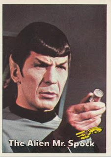
The popularity of Star Trek re-runs led to Topps putting out a set for that show. Here they eschewed the color border, with the result looking a lot like the '57 baseball set.
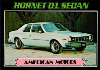
The most unusual card set for Topps in '76 was the Autos of '77. Here Topps went with a black border and futuristic font for the top, like the '71 baseball set, but using the more art-deco style nameplate of the '72 baseball set. A blue '77 Hornet was the family car from when I was born until I was ten years old.
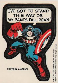
The only real nod to the bicentennial was the "Hysterical History" set, with humorous captions on pictures from American history. This is an error card by the way ("pumpernickle").

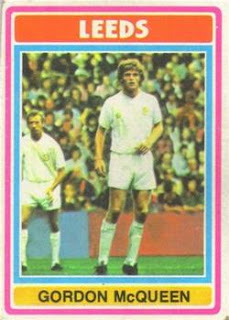

Was McQueen a giant?
ReplyDeletei remember seeing some 1976 football cards around 1979 or so and thinking topps should use that as a baseball card design - swapping out the football for a baseball, of course. fleer beat them to the punch in 1981...
ReplyDeleteI'm pretty sure Topps had at least some involvement in the Hostess sets, at least in terms of providing photos. Some of the cards have Topps' airbrushing and some of the photos have been recycled in later Topps products (see, for example, George Brett in 1979 Hostess and 2015 Topps Archives). Whether Topps also had say over the design I have no idea.
ReplyDeletePretty sure Topps had nothing to do with the making of the Kellogg's cards of that era.
The baseball design is my favorite... followed by King Kong, then basketball.
ReplyDeleteGood year for non-sports.
ReplyDelete