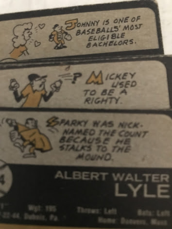
1973 is arguably the best year ever for card backs. I know it is my favorite. There are so many fun cartoons, most of them illuminating fun aspects of players' personal lives. Night Owl summed it up more eloquently than I could in a post from 2011.
The backs have a nice balance of statistics, bio, and cartoon. It seems the vertical layout gave Topps room for a greater range of information. (I thought this cartoon was odd - what it doesn't make clear is that Maddox turned down the Astros to go to college.)
I went through the set like I did the others, to pick out a few cartoons I liked best. I ended up picking over 100.
Should be "appearances". Error card!
One of the commenters on Night Owl's blog, on the topic of the many cartoons that referenced players' military service, that the term "Viet Nam" was never used. Turns out it was, on Eddie Watt's card. I wonder if the cartoon on Rick Wise's card was a little controversial?
"Cocktail lounge" was the nice way to say "bar" back then.
"Watching football" ha ha
Same cartoon as "Jimmy likes to go fishing" above. I love my Tim McCarver 1/1 OUCH! parallel.
"Volunteer dentistry" sure sounds strange but Arlin was a dental school graduate and was a full-time dentist after his playing career. Weird to see "running back" in quotes but the term was still fairly new in '73. Topps was using that term on their cards already, though.
Second "spider" in the set, with a similar, though not the same, cartoon.
There are a few guns in the set, for example for hunting hobbies. I think this was the only one to show graphically show the ballplayer firing.
Some product placement - the gas pump has a Chevron logo.
Notice the upside down musical notes. Did the cartoonist not know how to draw notes?
Another error, on Thurman Munson's card. And when you think of Bobby Bonds, do you think of an 1890s white guy? You do now.
More product placement - the CBS "eye" logo.
Finally, there are these two cards, numbered 10 and 11 in the set. I really wish one was oriented the other way, would have made a great double panel.


Having just recently ripped a blaster of this year's Heritage, seeing these really underlines how terrible a job Topps did with the cartoons in Heritage this year. Instead of interesting stuff about hobbies, offseason jobs, and nicknames, it's just all bland baseball accomplishments, with mostly the same cartoons over and over. (I feel like I got a dozen cards with the same drawing of a player holding a trophy.) I realize that players don't need to work at gas stations in the off-season anymore, but surely there's some interesting personal stuff they could have used.
ReplyDeleteThe only set now that approaches something that the '70s Topps cartoons did is Big League with its player factoids, and even some of them are pretty lame. Players have their own PR agents now and MLB wants their players to look like superheroes and the result is bland card backs.
Delete